
Use a single-column email as your default, then add multi-column blocks only when they make the message easier to scan on desktop. That is the safest play for responsive email marketing. Mobile still matters a lot. Litmus reported that mobile made up 41.6% of email opens in 2023 [source: Litmus]. So yes, your email has to look good on a tiny screen first.
TLDR: Single-column layouts are best for most responsive emails because they are simple, fast, and mobile-friendly. Multi-column layouts can work well for product grids, menus, and desktop-heavy audiences, but they need more testing. For example, a small clothing store might send a one-column sale email to 20,000 subscribers and see a 14% higher click rate on phones because the button is easier to tap. If your email has one main goal, use one column.
Why this choice matters
Email is weird. It is not a normal web page. Gmail, Outlook, Apple Mail, and Yahoo can all treat the same design in different ways. Honestly, it feels like email clients meet in a secret room and agree to make designers grumpy.
A layout that looks clean in Apple Mail can break in Outlook. A neat two-column product block can stack oddly on a phone. A button can slide to the wrong spot. Fun times.
That is why layout choice matters. It affects:
- Readability
- Click rate
- Load speed
- Mobile display
- Design time
- Testing pain
Let’s keep it simple.
What is a single-column email?
A single-column email stacks everything in one vertical line. One hero image. One headline. One paragraph. One button. Then maybe another block below.
It reads like a nice little ladder.
This style works well because people scroll. They do not study your email like it is ancient treasure. They skim. They tap. They leave.
Single-column designs are great for:
- Newsletters
- Promotions
- Welcome emails
- Event invites
- Product launches
- Cart reminders
- Lead nurturing emails
The main benefit is focus. The reader sees one thing at a time. There is less noise. There is less guessing.
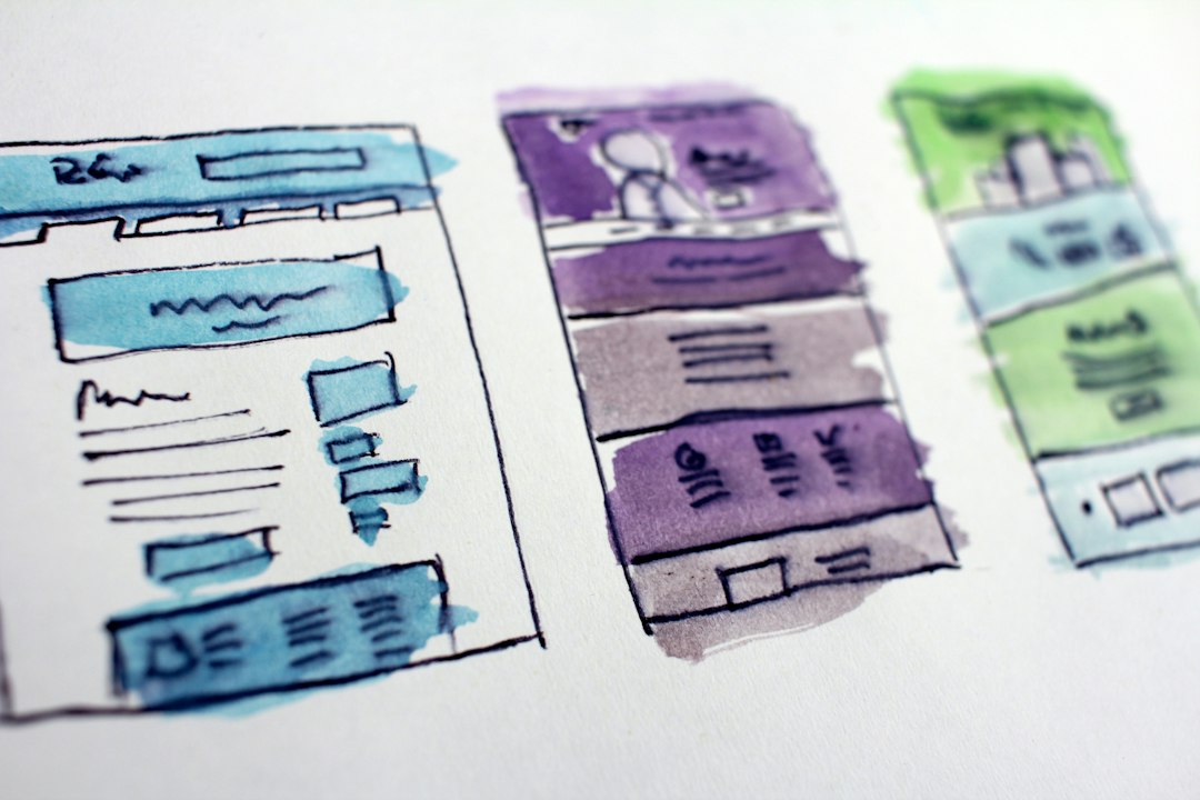
Why single-column design usually wins
Single-column emails are easier to read on phones. That is the big win. No pinching. No tiny text. No awkward side-by-side boxes squeezed into a sad little rectangle.
They also make calls to action stronger. If your email has one button, and that button sits under the main message, the path is clear.
Here is a simple flow:
- See the offer.
- Understand the value.
- Tap the button.
Beautiful. No drama.
Single-column layouts also save time. You can build them faster. You can edit them faster. You can test them faster. Expect to waste time on tiny alignment fixes with complex layouts. A single-column email avoids much of that nonsense.
They are also safer for accessibility. Larger text fits better. Buttons can be wider. Spacing feels cleaner. Screen readers often handle the content in a more natural order.
What is a multi-column email?
A multi-column email uses two, three, or more columns in the same row. Think product cards. Image on the left, text on the right. Three offers sitting side by side.
This can look sharp on desktop.
It can also go sideways on mobile.
Most responsive multi-column emails stack columns on small screens. A three-column product row becomes three vertical blocks. That can work well. But only if the code is solid and the design is planned for stacking.
Multi-column layouts are useful for:
- Product grids
- Feature comparisons
- Digest emails
- Restaurant menus
- Travel deals
- Real estate listings
- Desktop-focused B2B emails
They help when readers need to compare items. Three shoes. Two pricing plans. Four blog posts. That kind of thing.

The catch with multi-column layouts
The catch is that multi-column email design can be fussy. It may take one extra minute to build a desktop section, then thirty extra minutes to fix why Outlook added mystery gaps. Not ideal.
Multi-column designs need more care because:
- Columns may stack in the wrong order.
- Images may resize badly.
- Text blocks may become uneven.
- Buttons may stop lining up.
- Older email clients may ignore modern CSS.
Email support for modern layout CSS is still patchy. For example, CSS Grid is not something you can trust across all major inboxes [source: Can I Email]. So email developers often use tables. Yes, tables. The 2003 energy is strong here.
This does not mean multi-column is bad. It just means it needs a plan.
When to choose single-column
Use a single-column layout when your email has one main goal.
That goal might be:
- Buy this product.
- Read this article.
- Book this demo.
- Confirm this account.
- Use this coupon.
- Download this guide.
Single-column works best when speed matters. The reader can understand the email in seconds. No sorting. No comparing. No mental gymnastics.
It is also the better pick if your audience is mobile-heavy. If more than half of your opens come from phones, start with one column. Your thumbs will thank you.
When to choose multi-column
Use a multi-column layout when the content has groups.
For example:
- Three best sellers in one row.
- Two plan options side by side.
- Four recent blog posts in a digest.
- A feature list with icons.
Multi-column layouts can make a long email feel shorter on desktop. They can show more choices above the fold. They can also make visual sections feel tidy.
But be careful. More choices can mean fewer clicks. If every block screams for attention, nothing wins.
A good rule: use multi-column sections for browsing, not for urgent action.
A simple decision rule
Ask this question:
“Do I want the reader to do one thing, or choose between many things?”
If the answer is one thing, use single-column.
If the answer is many things, use multi-column. Then test it hard.
Here is a quick cheat sheet:
- Flash sale: Single-column.
- Monthly newsletter: Single-column or mixed.
- Product catalog: Multi-column.
- Welcome email: Single-column.
- Pricing comparison: Multi-column.
- Abandoned cart: Single-column.

Best practices for responsive email layout
Keep the design friendly. Keep it clear. Keep it tappable.
- Use a 600px desktop width. It is still a common email standard.
- Make body text at least 14px to 16px. Tiny text is rude.
- Use large buttons. Aim for at least 44px tall.
- Keep one clear main CTA. More buttons can cause doubt.
- Compress images. Slow emails lose people.
- Test dark mode. Your colors may flip in strange ways.
- Check Outlook. Yes, still. Sorry.
If you use multi-column blocks, decide how they stack on mobile. The top item should still make sense. Do not place the key offer in the third column if it will drop far down on phones.
What about hybrid layouts?
You do not have to pick one style for the whole email. Many strong emails use both.
For example:
- A single-column hero section.
- A two-column feature section.
- A single-column testimonial block.
- A three-column product row.
- A final full-width CTA.
This gives you focus at the top and variety below. It is often the best of both worlds.
Just do not get carried away. If the email starts to look like a furniture catalog fell down the stairs, simplify it.
The final pick
Single-column is the safest default for responsive email marketing. It works on phones. It keeps attention tight. It is easier to build and test.
Multi-column is best for choice-based content. Use it when comparison helps the reader. Use it when desktop viewing matters. Use it when your content truly needs a grid.
The smartest approach is not fancy. It is practical. Start with the reader. Start with the goal. Then choose the layout that removes friction.
If the email feels easy to read on a phone while you are half awake and holding coffee, you are probably on the right track.