
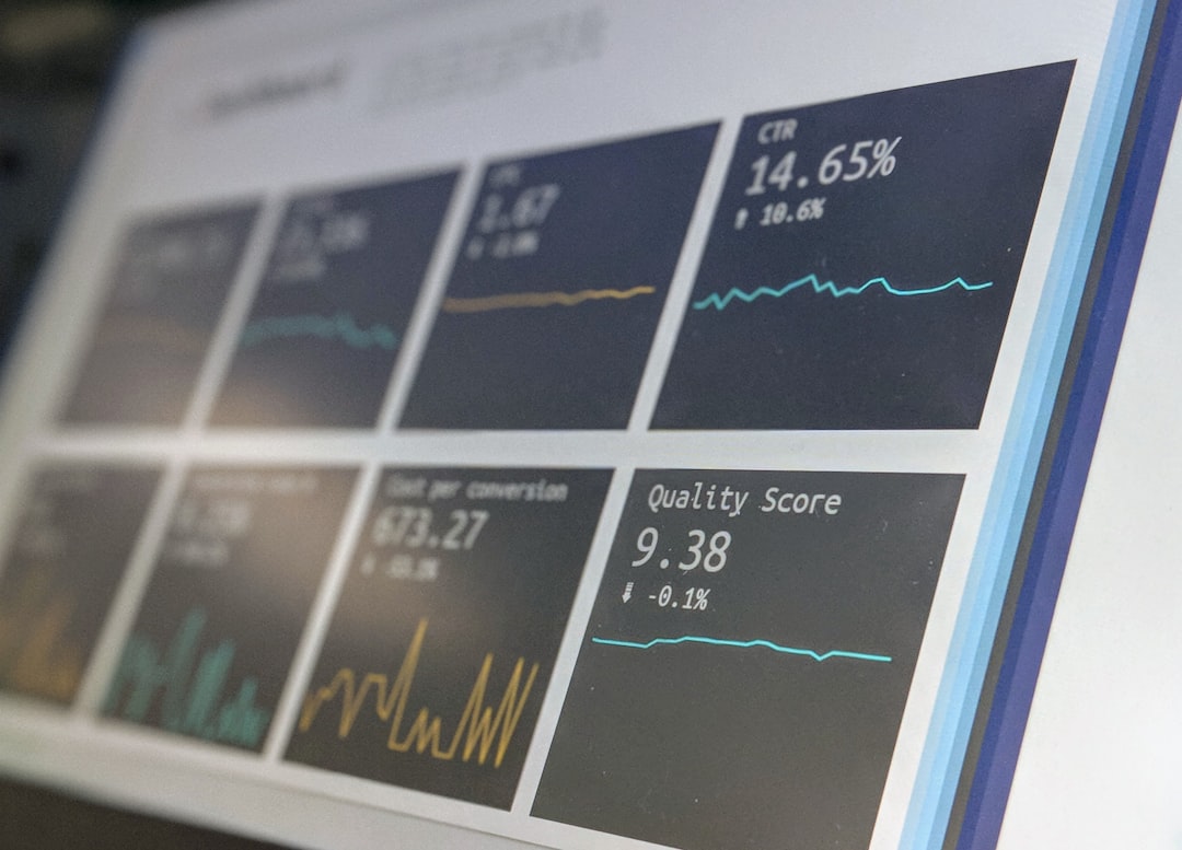
CountUp.js is a lightweight JavaScript library for animating numbers from one value to another. Used carefully, it can make dashboards, SaaS landing pages, investor pages, and analytics interfaces feel more responsive without overwhelming users. The key is not animation for its own sake, but using motion to draw attention to metrics that genuinely matter.
TLDR: CountUp.js is best used for important performance indicators such as revenue, active users, conversion rates, uptime, or campaign results. For example, a SaaS dashboard might animate 12,480 monthly active users, 98.7% service uptime, and $84,300 monthly recurring revenue when the page loads. In analytics interfaces, animated counters can improve scanability by helping users notice changes faster, especially when paired with clear labels and restrained timing.
Why Use CountUp.js in Professional Interfaces?
Numbers are often the most important part of a business interface. However, static figures can blend into the background, especially on pages with many cards, charts, and tables. CountUp.js adds a controlled transition that helps users recognize that a value is meaningful, updated, or worth reviewing.
Because CountUp.js is small and focused, it is suitable for production interfaces where performance matters. It supports decimals, separators, prefixes, suffixes, easing, duration control, and callbacks. That makes it flexible enough for both marketing pages and data-heavy products.
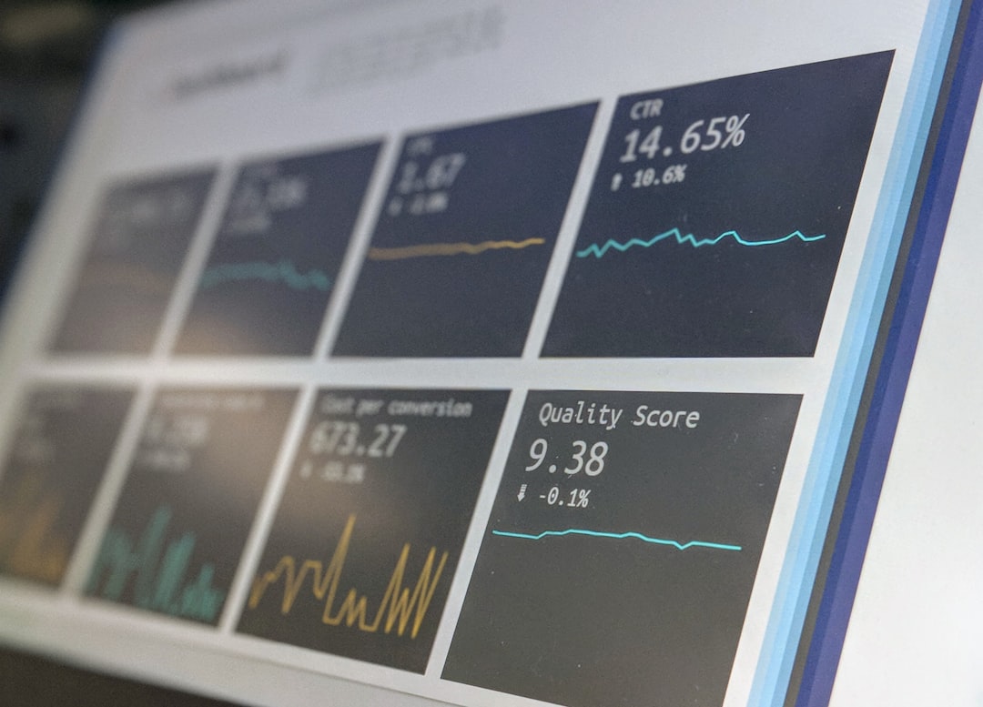
1. SaaS Revenue Counter
A common use case is highlighting monthly recurring revenue on an internal dashboard. Instead of showing a plain number, CountUp.js can animate the value from zero to the current amount when the dashboard loads.
- Example metric: $84,300 MRR
- Best placement: top row of an executive dashboard
- Recommended duration: 1.5 to 2 seconds
This works well because revenue is a primary decision-making metric. Add a prefix such as $ and use comma separators for readability. Avoid repeating the animation too often; it should feel informative, not decorative.
2. Landing Page Customer Count
Landing pages often use social proof to build trust. A counter showing the number of customers, downloads, or organizations served can make a claim more concrete.
For example, a cybersecurity product might display “Protected 18,500+ endpoints”. CountUp.js can animate the value to 18,500 while the suffix remains visible. This gives the metric more presence without relying on exaggerated visual effects.
Best practice: only use numbers that are accurate or reasonably current. Inflated customer counts can harm credibility if users later discover inconsistencies.
3. Conversion Rate Counter
Marketing teams often monitor conversion rates across landing pages, campaigns, and checkout flows. CountUp.js can animate decimal values such as 7.42%, making percentage-based performance easier to spot.
- Use decimals: 2 decimal places for precision
- Use suffix: %
- Use color carefully: green for improvement, red for decline
This example is especially useful in A/B testing dashboards. If Variant B improves signups from 5.81% to 7.42%, an animated counter can help stakeholders quickly identify the stronger result.
4. Real-Time Active Users Counter
For analytics products, a live active users counter can show how many people are currently using a product, website, or platform. CountUp.js can update from the previous value to the new value whenever fresh data arrives.
For instance, a product analytics dashboard might move from 1,284 to 1,319 active users after receiving a new API response. The transition helps users understand that the figure changed, instead of forcing them to compare numbers manually.
Important: if the number updates very frequently, keep the animation short. Constant movement can distract users and reduce trust in the interface.
5. Server Uptime Counter
Infrastructure dashboards benefit from stable, precise metrics. A CountUp.js animation can present uptime as a percentage, such as 99.982%, with three decimal places.
This is useful for service status pages, DevOps dashboards, and enterprise reporting. Since uptime is a trust signal, the design should remain restrained. Pair the animated number with supporting details such as incident count, average response time, and reporting period.
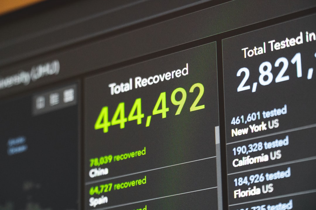
6. E-Commerce Sales Counter
E-commerce teams often track daily sales, order volume, average order value, and refunded revenue. CountUp.js can be used to animate a sales total such as $126,940 for the current day or week.
- Daily revenue: highlights short-term performance
- Orders processed: shows operational activity
- Average order value: supports pricing and bundling decisions
This type of counter is most effective when used above charts or tables. The counter gives an immediate summary, while deeper components provide the explanation behind the number.
7. Fundraising Progress Counter
Nonprofits, startups, and crowdfunding campaigns can use CountUp.js to display fundraising progress. A page might animate from zero to $412,750 raised, alongside a progress bar showing the target of $500,000.
This approach works because it combines emotional momentum with transparent reporting. However, the counter should be connected to reliable data. If possible, include a timestamp such as “Updated 15 minutes ago” to reinforce trust.
8. Learning Platform Completion Counter
Education platforms can use animated counters to show learner progress. Examples include completed lessons, total study minutes, quiz accuracy, or certificates earned.
A student dashboard might show 42 completed lessons, 86% quiz accuracy, and 1,240 minutes studied. These counters help learners understand their progress at a glance. They can also encourage continued engagement when used responsibly.
Note: avoid making the interface feel manipulative. Educational metrics should support motivation, not create unnecessary pressure.
9. Agency Results Counter
Digital agencies often need to communicate measurable results to prospective clients. CountUp.js can support case study sections by animating metrics such as organic traffic growth, lead volume, or return on ad spend.
For example, a case study could display:
- 143% increase in organic traffic
- 3,820 qualified leads generated
- 4.6x return on ad spend
These examples are persuasive because they are specific. The more concrete the numbers are, the more credible the presentation becomes. If the results are based on a defined period, include that context clearly.

10. Financial Analytics Counter
Financial dashboards can use CountUp.js for balances, expenses, deposits, portfolio value, or projected cash flow. Since financial data requires accuracy, formatting is essential. Use proper currency symbols, decimal places, and separators.
A portfolio dashboard might animate $248,916.72 as the current account value, while a secondary counter shows +6.8% year-to-date growth. The animation should be subtle, especially when handling sensitive or high-value information.
Professional recommendation: do not animate financial figures in a way that hides volatility or risk. The interface should make information clearer, not more theatrical.
Implementation Tips for Better Results
- Use animation sparingly: animate only the most important numbers on the page.
- Keep durations reasonable: most counters work best between 1 and 2.5 seconds.
- Respect accessibility: avoid excessive motion and consider users who prefer reduced motion.
- Format numbers properly: use commas, decimals, prefixes, and suffixes where appropriate.
- Update smoothly: when data changes, animate from the previous value instead of restarting from zero.
Conclusion
CountUp.js is a practical tool for making numerical information easier to notice and understand. Its strongest applications are dashboards, landing pages, analytics products, status pages, and performance reports where numbers carry business value.
The best examples use animation with restraint, accurate data, and clear labels. Whether you are showing monthly revenue, conversion rate, active users, or server uptime, CountUp.js can make important metrics more readable while preserving a serious, professional user experience.