

Search engines increasingly reward websites that deliver fast, clear, and usable experiences on every screen size. As mobile browsing has become the default for many users, responsive design has moved from being a visual preference to an essential SEO factor. A website that adapts smoothly to phones, tablets, and desktops is more likely to satisfy visitors, reduce friction, and send stronger quality signals to search engines.
TLDR: Responsive design helps websites rank better because it improves mobile usability, page experience, crawl efficiency, and user engagement. Search engines prioritize pages that load quickly, fit smaller screens, and make content easy to access. A mobile-friendly site can reduce bounce rates, increase conversions, and support stronger organic visibility. In modern SEO, responsive design is not optional; it is a foundation for long-term performance.
What Responsive Design Means for SEO
Responsive web design is an approach in which a website automatically adjusts its layout, images, navigation, and content structure based on the visitor’s device. Instead of maintaining separate desktop and mobile versions, a responsive site uses flexible grids, scalable media, and CSS rules to present one consistent experience across screen sizes.
From an SEO perspective, this matters because search engines aim to rank pages that serve users well. If a visitor lands on a page from a smartphone and must pinch, zoom, scroll sideways, or wait too long for content to load, the experience is poor. That poor experience can lead to quick exits, lower engagement, and fewer conversions. Over time, these signals can weaken organic performance.
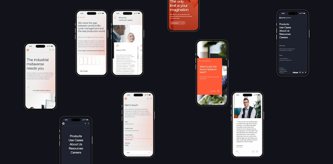
Mobile-First Indexing Changed the Rules
One of the biggest reasons mobile-friendly websites rank better is mobile-first indexing. This means search engines primarily use the mobile version of a page for indexing and ranking. If the mobile version has missing content, broken elements, slow loading times, or poor usability, the site’s overall search visibility may suffer.
Responsive design helps avoid many of these problems because the same core content and URL are used across devices. Search engines do not need to compare two separate versions of the same page, and site owners are less likely to create inconsistencies between desktop and mobile experiences. This makes responsive design a cleaner, more reliable structure for organic search.
Better User Experience Supports Better Rankings
SEO is no longer only about keywords and backlinks. User experience plays a major role in how well a page performs. A responsive website improves several important experience factors:
- Readability: Text adjusts to fit smaller screens without requiring zooming.
- Navigation: Menus become simpler and easier to tap on mobile devices.
- Accessibility: Buttons, forms, and links are easier to use across devices.
- Consistency: Visitors receive the same brand experience whether browsing from a phone or desktop.
When visitors can move through a website easily, they are more likely to stay longer, view more pages, and complete meaningful actions. These behaviors may not work as direct ranking buttons, but they contribute to the broader quality signals that search engines evaluate.
Responsive Design Improves Page Speed
Page speed is a critical part of mobile SEO. Mobile users often browse on slower connections, and even a delay of a few seconds can increase abandonment. A responsive design, when built properly, can improve speed by serving flexible layouts, optimized images, and efficient code.
However, responsive design alone does not guarantee fast performance. A site can be responsive and still be slow if it uses oversized images, excessive scripts, or heavy visual effects. The strongest SEO results come when responsive design is combined with image compression, clean code, browser caching, lazy loading, and reliable hosting.

One URL Structure Makes SEO Simpler
Responsive websites typically use one URL for each page, regardless of device. This is beneficial because it concentrates ranking signals in one place. Links, shares, canonical signals, and indexing data all point to a single version of the page.
Older mobile setups often used separate URLs, such as a mobile subdomain. While this can work when implemented correctly, it creates more room for technical errors. Duplicate content issues, incorrect canonical tags, faulty redirects, and mismatched content can all affect rankings. A responsive structure reduces these risks and makes SEO management more efficient.
Lower Bounce Rates and Higher Engagement
A non-mobile-friendly site often frustrates visitors immediately. Small text, crowded layouts, tiny buttons, and horizontal scrolling can cause users to leave within seconds. This is especially damaging when visitors arrive from search results with clear intent.
Responsive design helps reduce this friction. Pages become easier to scan, calls to action become more visible, and forms become simpler to complete. For businesses, this can lead to more inquiries, sales, bookings, or signups. For publishers, it can increase time on page and page views. In each case, the website becomes more aligned with both user needs and search engine expectations.
Core Web Vitals and Mobile Friendliness
Search engines use page experience signals, including Core Web Vitals, to understand how users perceive a website. These metrics focus on loading performance, interactivity, and visual stability. A responsive website can support stronger Core Web Vitals when it is designed with performance in mind.
- Largest Contentful Paint: Measures how quickly the main content loads.
- Interaction to Next Paint: Measures how quickly a page responds to user interactions.
- Cumulative Layout Shift: Measures unexpected movement of page elements.
Mobile layouts are especially vulnerable to layout shifts and slow loading images. A responsive design that reserves image space, prioritizes visible content, and avoids intrusive popups can create a smoother experience and stronger technical SEO foundation.
Responsive Design Helps Local SEO
Mobile friendliness is especially important for local search. Many users search for nearby products, services, restaurants, clinics, stores, and professionals from their phones. These searches often have immediate intent, such as calling a business, getting directions, or checking opening hours.
A responsive local business website makes these actions easier. Clickable phone numbers, simple contact forms, readable service pages, and fast-loading location details can all improve the mobile journey. When a site supports user intent effectively, it has a better chance of turning search visibility into real-world results.

Common Responsive SEO Mistakes
Although responsive design is powerful, mistakes can limit its SEO value. Common issues include hiding important content on mobile, using images that are too large, placing buttons too close together, and allowing popups to block the main content. Another frequent problem is designing for appearance while ignoring speed and accessibility.
Search engines should be able to crawl and understand the same important content that users see. If mobile layouts remove key headings, internal links, product details, or structured content, rankings may suffer. A responsive site should simplify presentation without weakening substance.
Conclusion
Responsive design improves SEO because it aligns with the way people search, browse, and interact with websites today. It helps search engines crawl content more efficiently, supports mobile-first indexing, improves usability, strengthens page experience, and reduces technical complexity. For any organization that depends on organic traffic, a mobile-friendly website is not merely a design upgrade; it is a strategic SEO investment.
FAQ
Why does responsive design matter for SEO?
Responsive design matters because it improves mobile usability, keeps content consistent across devices, and supports mobile-first indexing. These factors help search engines understand and rank a website more effectively.
Is responsive design a direct ranking factor?
Mobile friendliness and page experience are important ranking considerations. Responsive design supports these areas by making pages easier to use, faster to access, and more consistent across devices.
Can a responsive website still rank poorly?
Yes. A responsive layout alone does not guarantee strong rankings. The site also needs quality content, technical optimization, fast loading times, strong internal linking, relevant keywords, and trustworthy backlinks.
How does responsive design affect mobile-first indexing?
With mobile-first indexing, search engines primarily evaluate the mobile version of a page. Responsive design helps ensure that mobile users and search engines receive the same important content and structure.
What is the difference between mobile-friendly and responsive design?
A mobile-friendly site works acceptably on mobile devices, while a responsive site automatically adapts its layout to different screen sizes. Responsive design is one of the most effective ways to achieve mobile friendliness.
How can a website owner check if a site is mobile-friendly?
A website owner can use mobile usability reports, page speed testing tools, and manual testing on multiple devices. Important checks include readable text, tap-friendly buttons, fast loading, stable layouts, and complete mobile content.