
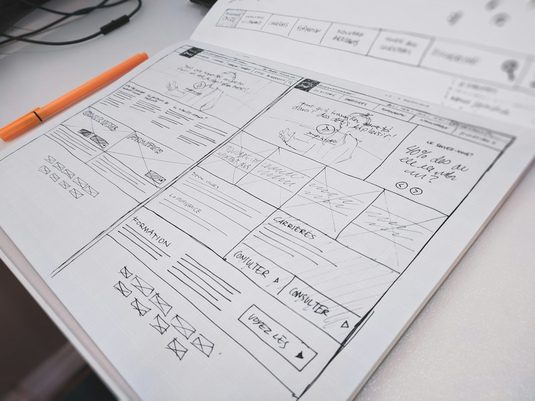
Use paper first when the question is structure or flow; move to Figma when the team must test interaction, copy, spacing, and handoff. For rapid interface prototyping, the best choice is rarely ideological. Paper is faster for rough thinking. Figma is stronger when decisions need to be shared, measured, revised, and built.
TLDR: Paper wins during the first 30 to 90 minutes of interface exploration because it removes tool friction and keeps people focused on decisions, not polish. Figma wins once a prototype must be clickable, reviewed by remote stakeholders, or tested with realistic UI states. For example, a small product team might sketch 12 checkout concepts on paper in one hour, then rebuild the strongest two in Figma and test them with 8 users. In that scenario, paper cuts early waste, while Figma provides evidence before engineering starts.
Why this comparison matters
Rapid prototyping is not about making pretty screens quickly. It is about reducing risk before costly work begins. A prototype should help the team answer a specific question: Can users understand this flow? Does this hierarchy make sense? Are we asking for too much information?
Paper and Figma answer these questions in different ways. Paper is direct, cheap, and forgiving. Figma is precise, shareable, and closer to production. Teams get into trouble when they use one tool for every stage. Honestly, it feels like half the wasted time in interface work comes from polishing screens before anyone has agreed on the basic path.
Where paper is better
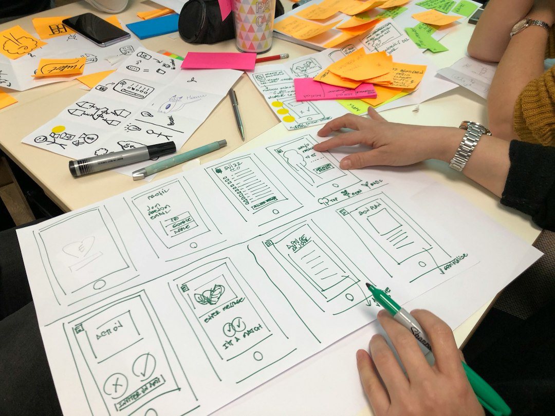
Paper is the fastest tool for messy thinking. It supports speed because there is almost nothing to configure. No frames. No grids. No component libraries. No permissions. A designer, product manager, or founder can sketch a screen in 60 seconds and throw it away without pain.
That disposability is valuable. People are less defensive about a rough sketch. A paper prototype has no illusion of finality, so feedback tends to focus on the idea. That helps teams avoid premature debate over button radius, color, or icon style.
Paper is especially useful for:
- Early flows: onboarding, checkout, booking, signup, account recovery.
- Information structure: deciding what appears first, second, and last.
- Workshop settings: getting input from non designers without teaching software.
- Alternative concepts: creating many directions before selecting one.
- Low risk usability checks: asking someone to point to what they would tap next.
The main strength of paper is also its limit. It cannot show real scrolling behavior, form validation, hover states, responsive layouts, or complex transitions. You can fake these with extra sheets, but the method breaks down fast. Expect to waste time on explanations once the interface depends on interaction rather than layout.
Where Figma is better
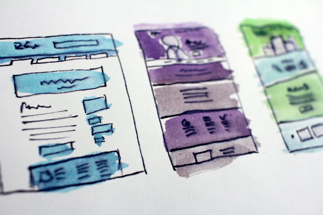
Figma is better when the prototype must behave like a product. It supports clickable flows, shared links, comments, components, design systems, and version history. This matters once the team has moved beyond broad structure and needs a tighter answer.
Figma also supports stronger collaboration for remote teams. A product lead in Berlin, a designer in Lisbon, and an engineer in Toronto can review the same frame without scanning notebooks or guessing intent. Comments stay attached to the screen. Changes can be tracked. Decisions become easier to audit.
Figma is especially useful for:
- Interactive user testing: click paths, modal behavior, menus, tabs, and form steps.
- Visual hierarchy: testing whether real copy, spacing, and contrast support comprehension.
- Design consistency: using shared components and tokens across screens.
- Stakeholder review: giving decision makers a clear artifact to inspect.
- Developer handoff: providing measurements, assets, states, and behavior notes.
The downside is tool gravity. Figma can pull teams into polish too early. A five minute layout question can become a 40 minute session of aligning layers, naming frames, fixing auto layout, and selecting icons. That work may be required later. It is expensive when the flow itself is still unproven.
Speed: paper is faster at the start
If the goal is volume, paper wins. In a 45 minute session, a team can sketch many variations of the same flow. That breadth matters. The first idea is often obvious. The fifth or sixth idea is where better tradeoffs appear.
Figma is still fast, but it rewards prepared systems. A designer with a mature component library can assemble screens quickly. Without that library, speed drops. New teams often spend more time selecting UI elements than solving the user problem.
A practical benchmark works well:
- Use paper when one screen takes less than 3 minutes to sketch.
- Use Figma when accuracy, interaction, and reuse matter more than raw output.
- Switch tools when the team starts asking questions paper cannot answer.
Testing quality: Figma gives cleaner evidence
Paper usability testing can be very effective, but it requires careful moderation. The facilitator often has to act as the system by swapping sheets, explaining states, and responding to taps. That can bias the session. Users may also behave differently because the prototype clearly is not real.
Figma creates a more controlled test. Users can click through screens on their own. The team can record completion rates, error points, and time on task. For example, if 6 of 10 users abandon a three step signup prototype at the permissions screen, that is a clear signal. Paper may reveal the same issue, but the evidence is usually less tidy.
Still, Figma fidelity can create false confidence. A polished prototype may look ready even when flows are weak. Serious teams separate usability from aesthetics. They ask: Did the user understand what to do? not Did the screen look good?
Cost and access
Paper costs almost nothing. That makes it ideal for small teams, classrooms, discovery workshops, and early founder research. It also reduces access barriers. Anyone can join the design process with a pen.
Figma has a different cost profile. The basic entry point is low, but serious team use may require paid plans, file organization, permissions, and governance. The larger hidden cost is maintenance. Components need care. Libraries drift. Old files pile up. It drives me crazy that teams often call a Figma file “the source of truth” while three outdated versions sit in nearby project folders.
Best workflow: combine them
The strongest rapid prototyping process uses both tools in sequence. Do not treat paper and Figma as rivals. Treat them as stages.
- Define the question. Example: “Can users complete account setup without support?”
- Sketch on paper. Produce several flows quickly. Avoid decoration.
- Critique the sketches. Remove weak paths. Mark unclear steps.
- Create a low fidelity Figma prototype. Use real copy where possible.
- Test with users. Track task success, hesitation, and wrong turns.
- Increase fidelity only after the flow works. Add components, spacing, and visual detail.
Decision guide
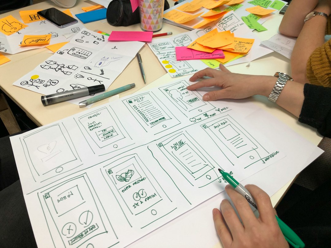
Choose paper if the problem is still vague, the team needs many options, or the meeting must stay fast. Paper is also better when stakeholders are too focused on visual taste. It keeps the conversation rough and useful.
Choose Figma if the prototype must be shared, clicked, tested remotely, or prepared for engineers. It is also the better choice when brand rules, accessibility checks, and real content affect the decision.
Use both if the project carries real business risk. Sketch first. Select quickly. Build the best candidate in Figma. Test it. Then refine. This sequence protects speed at the beginning and quality near the end.
The serious answer is simple: paper is for thinking, Figma is for proving. Teams that respect that split move faster and make fewer expensive guesses.