
A business cover photo is often the first large visual people see when they visit your social media page, company profile, event page, or online storefront. It sits at the top like a digital billboard, shaping expectations before a visitor reads a single post or clicks a button. A well-designed cover photo can communicate professionalism, personality, credibility, and purpose in just a few seconds. When done poorly, however, it can make even a strong business look inconsistent, outdated, or untrustworthy.
TLDR: A professional business cover photo should be clear, brand consistent, and designed for the platform where it appears. Use high-quality visuals, readable text, balanced spacing, and colors that match your brand identity. Keep the message simple, test how it looks on mobile and desktop, and update it regularly to reflect campaigns, seasons, or business milestones.
Why Your Business Cover Photo Matters
Your cover photo is more than decoration. It is a strategic branding asset. Whether it appears on Facebook, LinkedIn, YouTube, X, an event platform, or a business directory, it gives visitors an immediate impression of who you are and what you offer.
Think of it as your business’s front window. A clean, attractive storefront invites people in; a cluttered or confusing one makes people walk past. The same principle applies online. A polished cover image can help establish trust, highlight your value, and guide users toward an action such as following your page, visiting your website, booking a service, or learning more about your offer.
For small businesses especially, a professional cover photo can level the playing field. Even if you do not have a huge marketing budget, thoughtful design choices can make your brand look established and dependable.
Start with a Clear Objective
Before choosing colors, photos, or text, decide what your cover photo needs to accomplish. A cover photo without a clear purpose often becomes cluttered because the designer tries to include everything at once.
Ask yourself:
- Do I want to introduce my brand? This is ideal for new businesses or general profile pages.
- Do I want to promote a product or service? Use the cover photo to spotlight one main offer.
- Do I want to announce an event or launch? Include the key date, theme, and call to action.
- Do I want to build credibility? Consider showing your team, workspace, customer experience, or awards.
- Do I want to reinforce a seasonal campaign? Adapt colors and visuals while preserving brand recognition.
Once the goal is defined, every design choice becomes easier. A cover photo for a consulting firm might emphasize confidence and expertise, while one for a bakery may focus on warmth, texture, and product appeal.
Keep the Message Simple
One of the biggest mistakes businesses make is treating the cover photo like a brochure. They add a logo, slogan, phone number, website, list of services, promotional details, icons, testimonials, and a call to action. The result is visual overload.
A good cover photo should communicate one primary message. Visitors will not study it for long. They will glance, absorb, and move on. If the message is too crowded, they may absorb nothing.
Instead of writing “We provide accounting, payroll, tax planning, bookkeeping, audit support, and business consulting for startups and established companies,” try a simpler message such as:
- Smart accounting for growing businesses
- Helping local brands grow with confidence
- Fresh catering for unforgettable events
Short, memorable language is easier to read and more effective. If more details are needed, place them in the profile description, pinned post, website, or call-to-action button.
Use Brand Colors Consistently
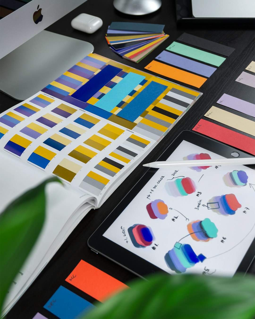
Color is one of the fastest ways to create recognition. If your brand already has a color palette, your cover photo should use it intentionally. This does not mean every image must be covered in your main brand color, but the overall look should feel connected to your logo, website, packaging, and other marketing materials.
For example, a financial services company may rely on navy, white, and silver to communicate stability and trust. A wellness brand may use soft greens, beige, and warm neutrals to suggest calm and balance. A technology company may choose dark backgrounds with bright accent colors to feel modern and innovative.
When using colors, pay attention to contrast. Text placed over a busy or similarly colored background can become unreadable. If needed, add a subtle overlay, gradient, or solid color block behind the text. The goal is not just beauty; it is clarity.
Choose the Right Imagery
Images carry emotional weight. A high-quality photo can make your business feel approachable, premium, energetic, elegant, or trustworthy. A generic or low-resolution image can do the opposite.
Depending on your business, you might use:
- Product photography to showcase what you sell.
- Team photos to create a human connection.
- Workspace images to show professionalism and atmosphere.
- Customer lifestyle photos to demonstrate the benefit of your service.
- Abstract backgrounds for a clean, corporate, or modern look.
Avoid images that look overly staged, pixelated, stretched, or unrelated to your brand. If you use stock photography, choose images that feel natural and specific rather than generic. A smiling person in a suit shaking hands may be acceptable in some contexts, but it is often forgettable. A more distinctive image related to your actual service can make a stronger impression.

Design for Mobile and Desktop
A business cover photo rarely appears the same way on every device. Desktop screens, mobile apps, tablets, and platform-specific layouts can crop the image differently. Important text or logos placed too close to the edges may be cut off.
To avoid this problem, keep essential elements near the center of the design. Use a “safe zone” where your logo, headline, and key visual remain visible across devices. Before publishing, preview the image on both desktop and mobile. If possible, also check it from different browsers or app versions.
Remember that profile photos often overlap the cover image, especially on social platforms. Do not place important text where the profile image, buttons, or interface elements may cover it. A beautiful design can lose its effectiveness if the tagline is hidden behind a profile picture.
Make Text Readable at a Glance
If your cover photo includes text, readability is essential. Decorative fonts may look stylish, but they can be hard to read quickly, especially on smaller screens. Choose clean typefaces that match your brand personality while remaining legible.
Follow these typography tips:
- Use no more than two fonts. Too many typefaces create a messy look.
- Prioritize hierarchy. Make the main message larger than supporting text.
- Use strong contrast. Dark text on a light background or light text on a dark background works best.
- Avoid tiny details. Small text is often unreadable on mobile.
- Leave breathing room. Space around text improves comprehension and visual appeal.
For many businesses, the best cover photo text is simply a short headline, a short subheading, and perhaps a call to action. If your logo already appears as your profile image, you may not need to repeat it prominently in the cover photo unless the platform layout requires it.
Balance Visual Interest with Professionalism
A professional cover photo does not have to be boring. In fact, strong branding often comes from the right mix of polish and personality. The key is balance. You want the design to feel engaging without becoming chaotic.
Use composition to guide the viewer’s eye. Place the most important element where attention naturally falls, such as the center or one side of the layout. Use negative space to prevent overcrowding. Align elements carefully so the design feels intentional rather than accidental.
If your brand is playful, you can use bold colors, lively photos, or illustrated elements. If your brand is luxury-focused, you may prefer minimal layouts, refined typography, and a restrained color palette. If your brand is technical, grids, clean lines, and data-inspired visuals can communicate precision.
Include a Subtle Call to Action
A cover photo can gently guide visitors toward the next step. However, the call to action should suit the platform and should not feel like an aggressive advertisement unless the page is built around a specific promotion.
Examples of effective cover photo calls to action include:
- Book your consultation today
- Explore our newest collection
- Join us for the upcoming webinar
- Visit our showroom this weekend
- Discover solutions for your growing team
Keep the wording brief. If the platform has a clickable button near the cover area, design your message to support that button. For example, if the button says “Contact Us,” the cover photo could include a headline like “Ready to simplify your marketing?” This creates a natural connection between message and action.
Update Your Cover Photo Regularly
A stale cover photo can make a page feel neglected. You do not need to redesign it every week, but periodic updates show that your business is active and attentive. This is especially useful for promotions, seasonal campaigns, events, product launches, new locations, holidays, or major announcements.
Consider creating several versions of your cover photo:
- Evergreen cover: A general branded image suitable year-round.
- Promotional cover: A campaign-specific design for sales or launches.
- Event cover: A time-sensitive design with date and location details.
- Seasonal cover: A refreshed look for holidays or seasonal services.
- Recruitment cover: A design focused on company culture and hiring.
Maintaining a consistent visual framework makes updates easier. For example, keep the same logo placement, type style, and color palette while changing the image or headline. This preserves brand recognition while keeping the page fresh.

Avoid Common Cover Photo Mistakes
Even simple errors can reduce the impact of your business cover photo. Before publishing, check carefully for issues that may make your brand look less professional.
- Low-resolution images: Blurry visuals can make a business appear careless.
- Too much text: Crowded designs are difficult to read and remember.
- Poor cropping: Important details may disappear on mobile or desktop.
- Inconsistent branding: Random colors and fonts weaken recognition.
- Outdated information: Expired promotions or old event dates create confusion.
- Weak contrast: Text that blends into the background loses effectiveness.
- Unclear message: Visitors should understand the purpose within seconds.
It is also wise to proofread every word. A typo in a cover photo is highly visible and can undermine trust. Ask someone else to review the design before it goes live, especially if it includes dates, prices, names, or contact information.
Match the Cover Photo to Your Industry
Different industries call for different visual approaches. A law firm, fitness studio, restaurant, software company, and landscaping business should not all use the same design style.
A law firm may benefit from a clean layout, confident typography, and imagery that suggests professionalism. A restaurant can use rich food photography to create appetite and emotion. A fitness brand may choose dynamic action shots and bold colors. A software company might use sleek interface visuals, abstract shapes, or customer outcome messaging. A local service business might highlight real team members, vehicles, or completed projects to build familiarity.
The best cover photo feels authentic to the business. It should not chase trends blindly. Instead, it should reflect what customers value most about your brand.
Use Your Cover Photo as Part of a Larger Brand System
Your business cover photo should not exist in isolation. It should connect with your profile image, posts, website, email graphics, ads, and printed materials. Consistency across these touchpoints helps customers remember you and builds confidence in your professionalism.
When people move from your social page to your website, the experience should feel seamless. They should see familiar colors, similar imagery, and a consistent tone of voice. This continuity tells visitors they are in the right place and dealing with a reliable organization.
A strong cover photo is not simply a pretty banner. It is a compact expression of your brand strategy. It introduces your business, supports your message, and encourages visitors to take the next step.
Final Thoughts
A professional business cover photo combines design discipline with brand storytelling. The most effective examples are simple, clear, visually appealing, and built with the viewer’s experience in mind. They use high-quality images, readable typography, consistent colors, and smart spacing to create a strong first impression.
Whether you are refreshing an established brand or creating your first online presence, take the time to design your cover photo with intention. A few thoughtful choices can transform the top of your page from an empty visual space into a powerful branding opportunity. In a crowded digital world, that first impression can be the reason someone pauses, trusts, follows, and eventually becomes a customer.