
Pick Figma for UI design. Pick Canva for quick visual content. If you are building an app, website, dashboard, or design system, Figma wins. If you need an Instagram post, flyer, pitch deck, or YouTube thumbnail before lunch, Canva wins.
TLDR
Figma is better for UI work. Canva is better for marketing visuals. For example, a startup making 25 app screens will save hours with Figma’s components and prototyping, while a social media manager making 30 posts a week will move faster in Canva. If your team is 70% product design, choose Figma. If it is 70% content creation, choose Canva.
Both tools are popular. Both live in the browser. Both help teams create nice things without installing giant software. But they are built for very different jobs.
Think of it like this:
- Figma is a professional workshop for product design.
- Canva is a friendly craft table for visual content.
One is for buttons, flows, grids, and prototypes. The other is for posters, social posts, menus, slide decks, and quick branded graphics.
What Figma does best
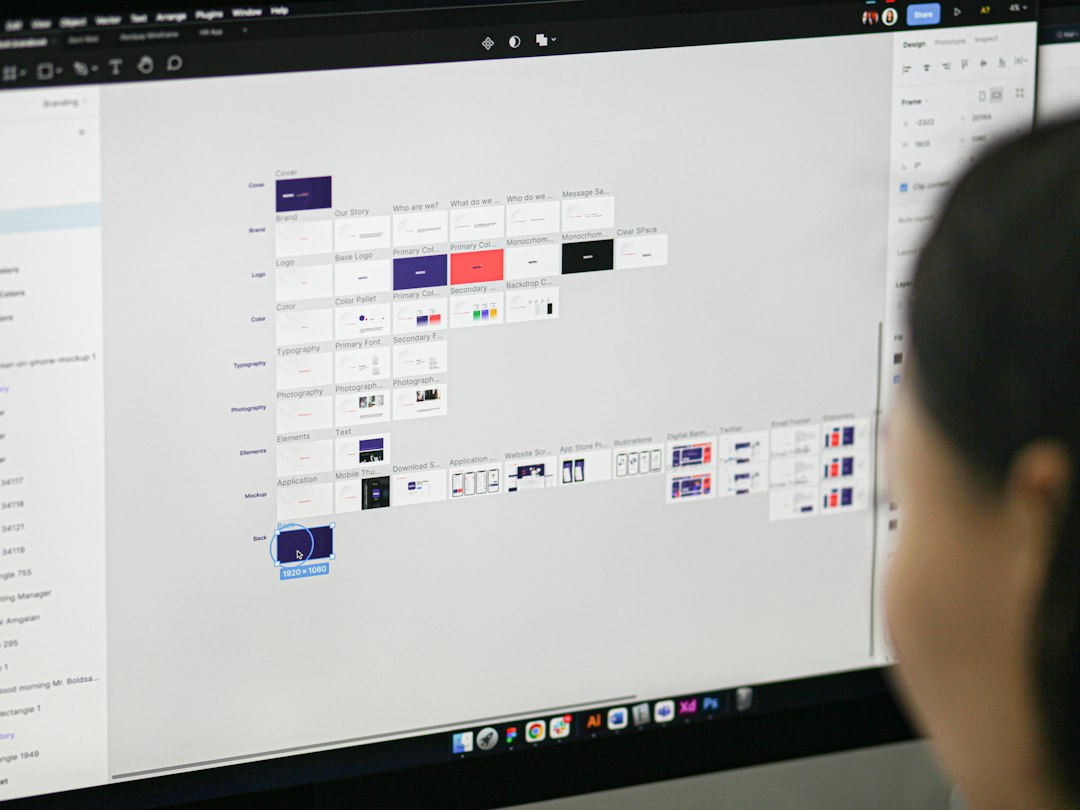
Figma is made for UI and UX design. That means screens. Lots of screens. Login screens. Checkout pages. Settings panels. Mobile apps. Web apps. SaaS dashboards. All the tiny parts that make users either smile or rage click.
Its best features are serious design features:
- Frames for app and web layouts.
- Auto layout for flexible spacing.
- Components for reusable buttons and cards.
- Variants for states like hover, active, and disabled.
- Prototypes to test user flows.
- Dev mode to help developers inspect designs.
This is where Figma feels strong. You can create one button and reuse it across 100 screens. Change the main version, and the rest update. Lovely. Less clicking. Less crying.
Figma also shines when teams work together. Designers can build. Product managers can comment. Developers can inspect spacing, colors, and assets. Everyone can stare at the same file and argue about whether the button should be 44 or 48 pixels tall.
Fun? Sometimes. Useful? Very.
Where Figma gets annoying
Figma is not hard at first. But it gets deep fast. Auto layout can feel like a puzzle box. Components are powerful, but messy files become a swamp. Honestly, it feels like one small spacing mistake can steal 20 minutes if the file is badly built.
It is also not the best tool for casual graphics. You can make a poster in Figma. You can make a social post. But should you? Maybe not.
Figma has fewer ready-made marketing templates than Canva. It is also less friendly for non-designers who just want to swap text, drop in a photo, and publish.
What Canva does best
Canva is built for speed. It is the tool you open when someone says, “Can you make this look nice?” and the deadline is rude.
Canva is great for:
- Instagram posts
- Stories and reels covers
- Flyers
- Presentations
- Posters
- Invitations
- Simple logos
- Ads
- Reports
- Menus
Its template library is huge. You can start with a polished design, change the colors, add your brand font, replace a photo, and export in minutes. That is the magic.
Canva also has simple tools for background removal, stock images, icons, video clips, animations, and brand kits. It is not trying to make you a product designer. It is trying to help you ship content before your coffee gets cold.

Where Canva gets annoying
Canva is fast, but it can feel boxed in. Precise layout control is weaker than Figma. If you want pixel-perfect UI spacing, you may get grumpy fast.
Expect to waste time on tiny adjustments if you are trying to design an app screen. Canva is not made for complex UI systems. It does not handle components, responsive app layouts, or detailed interactive prototypes like Figma.
Also, many templates look familiar. That is the price of speed. If many people use the same layouts, your content can start to look like everyone else’s. Add your own colors, images, and voice, or your post may scream “template.”
Figma vs Canva for UI design
Winner: Figma.
This one is not close. Figma is simply better for UI design. It gives you control over layout, spacing, design systems, and interaction flows.
If you are designing a mobile app, you need to think about states. What happens when there is an error? What does the empty screen show? How does the user move from sign up to payment? How does the mobile version differ from desktop?
Figma handles this well. You can map full user flows. You can link screens. You can test a clickable prototype. You can share it with users and watch where they get stuck.
Canva can mock up a screen. But that is mostly where the fun ends. It is not built for real product design work.
Figma vs Canva for visual content
Winner: Canva.
Canva is the clear choice for quick visuals. It is easier for beginners. It has more templates. It has built-in stock content. It makes exporting simple.
If your job is to feed social channels, Canva is a relief. Need five quote posts, two sale banners, a webinar slide, and a flyer? Canva can handle that without turning your day into a design marathon.
Figma can do it, but you will build more from scratch. That gives you control. It also costs time.
Collaboration: both are good, but different
Figma collaboration feels made for product teams. Comments sit on the design. Developers can inspect specs. Designers can work in the same file at the same time. It feels close to Google Docs, but for interfaces.
Canva collaboration feels made for content teams. One person can make a template. Another can edit copy. A manager can approve it. Then it can be exported or posted.
So the better tool depends on your team:
- Product team? Use Figma.
- Marketing team? Use Canva.
- Solo founder? You may need both.
- Small business owner? Start with Canva, add Figma if you build apps or websites.
Ease of use
Canva is easier. No shock there.
A beginner can open Canva and make something decent in 10 minutes. The menus are simple. The templates do most of the heavy lifting. You can drag, drop, type, export, and move on.
Figma takes more patience. A beginner can draw boxes and add text quickly. But the real power takes practice. Auto layout, constraints, styles, and components need time. Not years. But not five minutes either.
Pricing and value
Both tools offer free plans. That is great. You can test both without begging for budget.
Canva’s paid plans are very useful if you need brand kits, premium templates, stock assets, and background remover tools. The value is strong for creators and small teams.
Figma’s paid plans make more sense for professional design teams. Team libraries, project permissions, and advanced collaboration features matter when many people work on the same product.
Do not choose only by price. Choose by the work you do every week.
Which one should you choose?
Choose Figma if you:
- Design apps or websites.
- Build wireframes and prototypes.
- Work with developers.
- Need design systems.
- Care about pixel-level control.
Choose Canva if you:
- Create social media graphics.
- Make flyers, posts, and slides.
- Need results fast.
- Work with non-designers.
- Want lots of templates.
The simple verdict
Figma is the better design tool for UI. Canva is the better design tool for visual content. That is the clean split.
If you are making a product, use Figma. If you are promoting that product, use Canva. Many smart teams use both. Figma shapes the app. Canva sells the story.
So no, you do not need to force one tool to do everything. That is how files get weird and people get cranky. Pick the tool that matches the job. Your future self will be less annoyed.